Typesetting ToBI
A lifetime ago,1 back when I was still convinced I was on track to become a speech researcher, I spent a considerable amount of time dealing with ToBI tone markers.
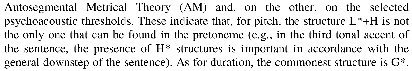
In case you need a refresher, or come from an entirely different walk of life, ToBI stands for “Tones and Break Indices”, and is a standard for speech researchers to mark intonation, or prosody. This sort of annotation is pretty essential for research, because it allows researchers to record these data, share them with their colleagues, and process it as a whole.
This last point is important, and is one of the reasons why the standard has been this successful: the transcription uses only ASCII characters that were and continue to be trivial to input, and easy to read by machines. This is in fact something that was identified as a strength in the original publication that described it:
[We believe ToBI will become a standard for prosodic transcription because, among other reasons,] it defines ASCII formats for machine-readable representations of the transcriptions which are in principle independent of the pitch extraction and signal available to the researcher.
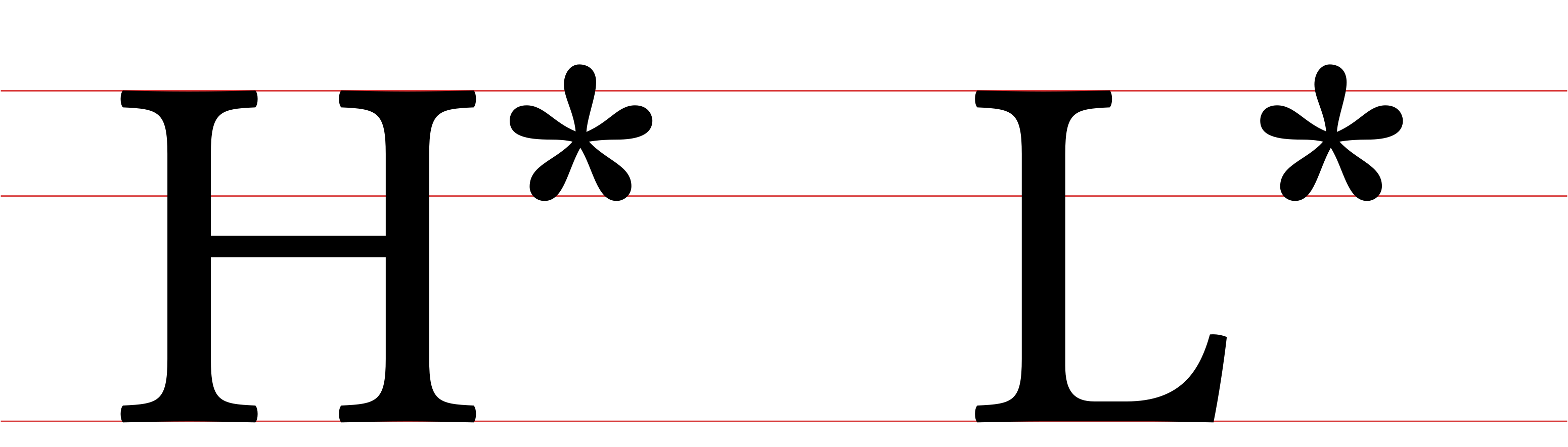
In brief, ToBI tone markers are largely made of H and L characters,
some of which might be marked as primary stresses with a * character, and
sometimes combined with + to make up complex tones.
The problem
The problem with these tones, as I imagine some of you might have immediately noticed, is that they are butt-ugly, and have absolutely zero chance of looking good in a paragraph of text.
And here is where the rubber meets the road: we want tone markers that use only ASCII characters so they are machine readable to be able to process our data. But once they’ve been processed, and we want to report the results, we are going to be putting those tones markers in an entirely different context: one where humans, and not machines, are the primary readers, and where they will be surrounded by more of those pesky human-readable sentences.
I’d posit that using the standard machine-readable notation in prose is ultimately wrong.
Before anyone gets the wrong idea: none of this, including the example above, is an indictment on the quality of the academic work that typesets these markers this way. I’m pretty sure that most people in academia does this because that’s how they’ve always seen it in print, and because they have better things to do with their time than obsess over the spacing of the characters in their publications.2
Then again, when I got around to writing my dissertation, I was procrastinating pretty heavily, and a lot of it was pretty much exactly obsessing over kerning and trying to make sure anything I wrote would simultaneously make Bringhurst and Tufte proud.
Which is to say: there was no way I was going to just print that in my thesis.
My solution
So I came up with a different way to do it that seemed better in my eyes:
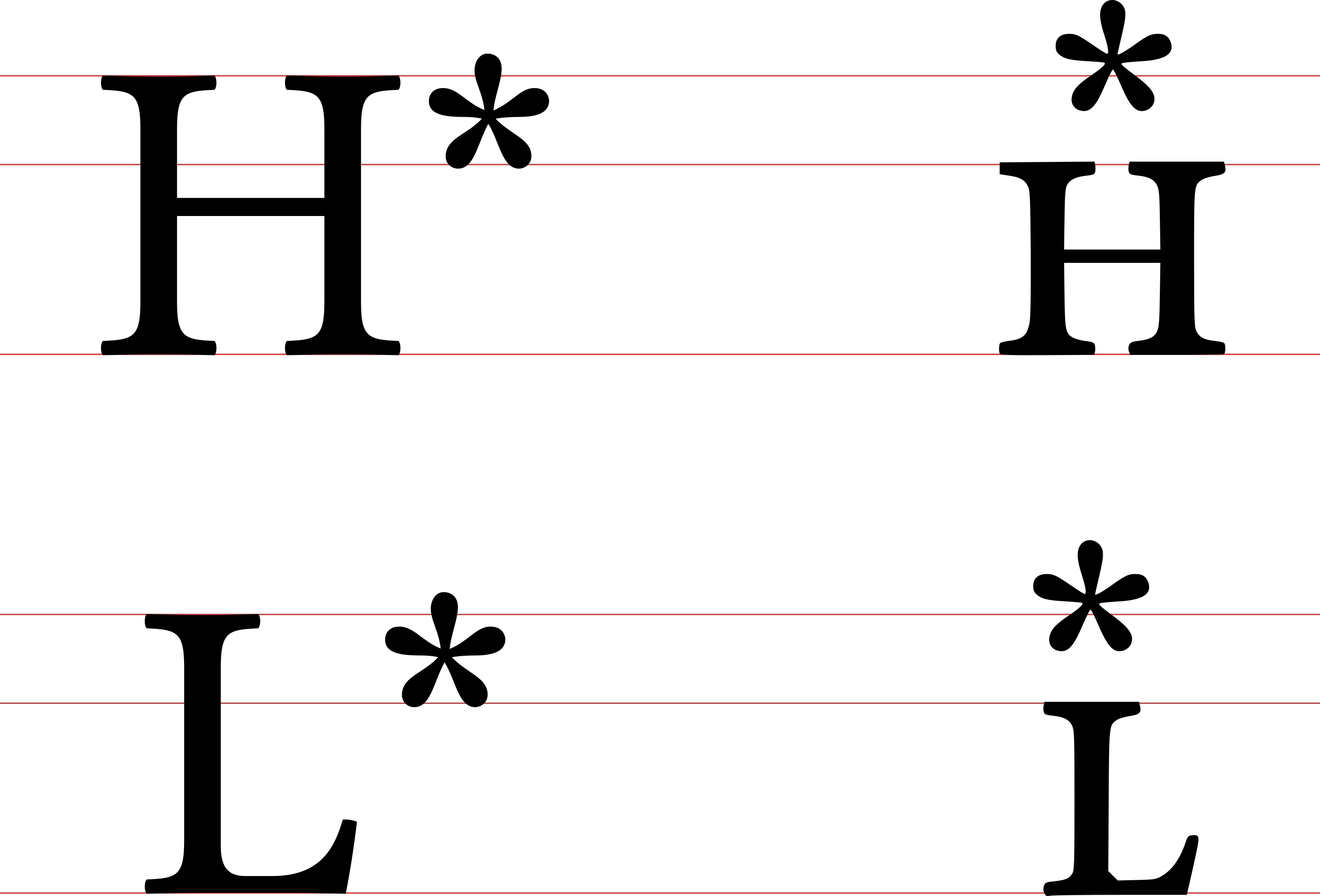
The fundamental idea was twofold. First, use small-caps instead of the
upper-case for H and the L to make the text blend into the surrounding
text. Second, recognise that the * character was marking a property of the
tone, which meant that anything that made this link easier to see should be in
scope.
The result, as seen above, makes the markers have less vertical movement (meaning that they can be read from left to right with the eye largely following stable horizontal line), and allows each of them to occupy the same amount of horizontal space, which promotes the idea that the tones are the fundamental unit at play.
This was easily accomplished in LaTeX.3 First we define some basic components:
\newcommand{\high}{\textsc{h}}
\newcommand{\low}{\textsc{l}}
\newcommand{\ToBIminus}{-}
\newcommand{\ToBIplus}{+}
Which can then be combined to generate the tones shown above:
\newcommand{\Lstar}{\low\kern-0.465em\raisebox{0.15em}{*}\kern0.09em}
\newcommand{\Hstar}{\high\kern-0.485em\raisebox{0.15em}{*}\kern0.11em}
What about compound tones
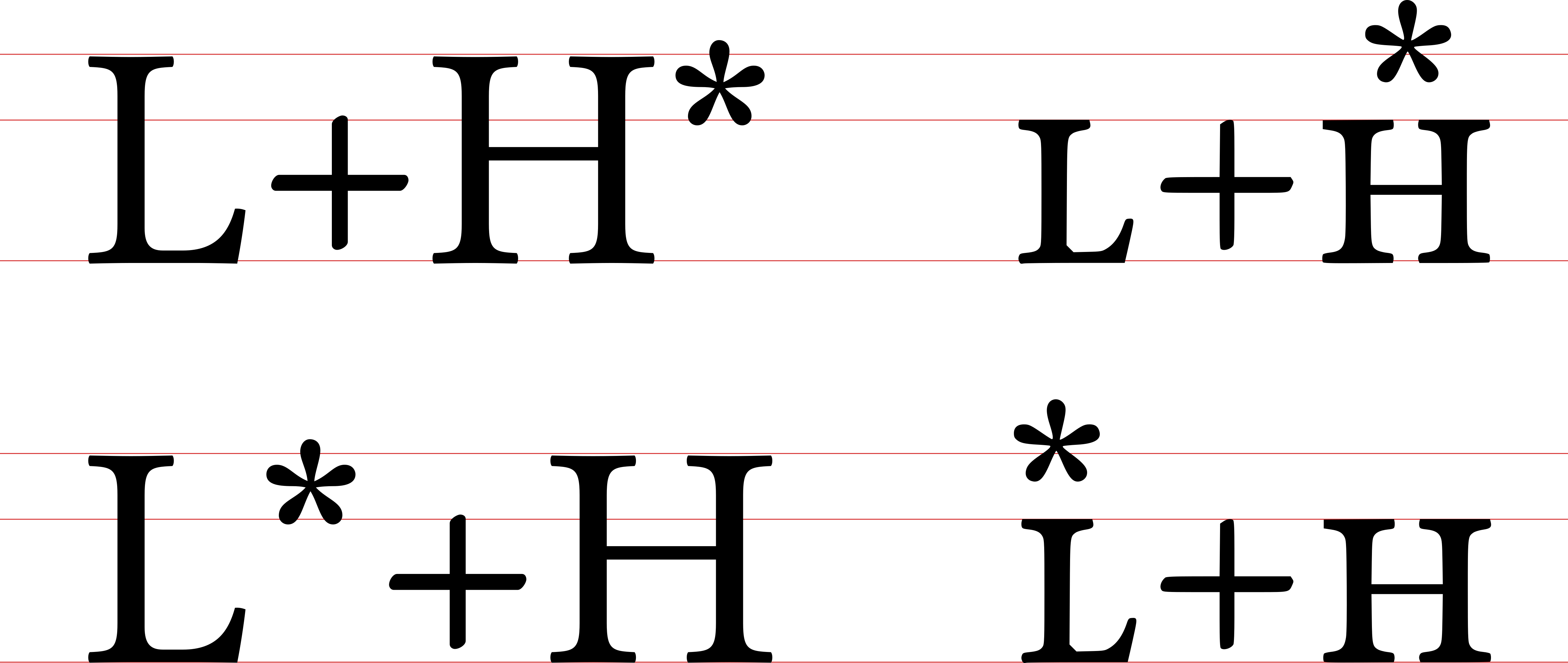
For compound tones, it’s just a matter of defining the rest of the relevant combinations:
\newcommand{\LHstar}{\mbox{\low\ToBIplus\Hstar}}
\newcommand{\LstarH}{\mbox{\Lstar\ToBIplus\high}}
\newcommand{\HLstar}{\mbox{\high\ToBIplus\Lstar}}
\newcommand{\HstarL}{\mbox{\Hstar\ToBIplus\low}}
I am pretty sure that the values used by me to do this are subject to a lot of improvement. And I’m sure also that, as much as I’m interested in typography, others are probably better than me at evaluating where I might have gone too far or not far enough.
Still, I’m very happy with the result as it looks in the document I was producing, and if I can share this and expose other people to the possibility of these tones not making your document look like someone coughed a bunch of letters on your page, I’ll consider my job here done. And I’d say that the results speak for themselves:
The best part of this? Because of the characters I used, the end results are still completely searchable using a standard PDF reader, which really highlights the fact that the storage of machine-readable information, and its display are different things, and we should not sacrifice the latter for the former.
References
- Silverman, K. et al. (1992) ToBI: A Standard for Labeling English Prosody In: The Second International Conference on Spoken Language Processing, ICSLP 1992, Banff, Alberta, Canada, October 13-16, 1992
-
Or at least what feels like a lifetime ago… ↩
-
After all, that strongly worded response to Reviewer #2’s passive-aggressive remarks is not going to write itself. ↩
-
In hindsight, my getting into LaTeX in order to write my dissertation, and the amount of time I spent not actually writing my dissertation, seems like a pretty clear symptom that I was dissatisfied with a purely academic career. ↩